BRAND GUIDELINES · v2.0 2026

nortly

Find your direction. Grow with confidence.

Logo usage guidelines: brand story, themes, motion, interactive states, loading states and downloadable assets.

NORTLY.APP
01

The brand & the name

Nortly comes from “North”. For thousands of years, north has meant orientation: sailors navigated by Polaris, and a compass still always points north. North is not just a direction — it is the symbol of the right course.

Nortly is the operating hub for Shopify App companies. Today a Shopify Partner's picture of their business is scattered across the Partner Dashboard, Stripe, support inboxes, emails and analytics. Nortly unifies customers, subscriptions, billing, events, support and automation in one place — so a founder opens it and thinks not “I opened a dashboard”, but “now I understand where my business is going.”

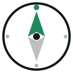
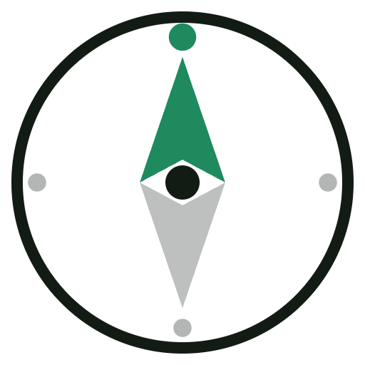
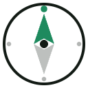
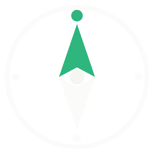
The logo is that idea made visible. The ring is the horizon of your business. The needle is your current course. The star at 0° is true north — the goal you steer by. It nods to the navigational language of the Shopify ecosystem (Polaris, Compass, Horizon) without copying any of it.

BRAND PROMISE
Every metric has a direction.
Every customer has a story.
Every business needs a north.
Why “Nortly”, not “North”: it is ownable as a trademark, short, easy to pronounce, looks balanced in a wordmark — and evokes direction rather than infrastructure.
02

The mark — construction

The Nortly mark is a compass that has found north. Both halves of the needle are geometrically identical, rotated 180° around the center — the mark stays balanced at any scale.

  • Needle height — 13/16 of the mark's field
  • The halves split exactly at the equator
  • The star always sits at 0° (true north)
  • The south half is always the theme's base color at 28–40% opacity
03

Light theme

For white and light-grey surfaces: marketing site, documents, email. Needle — Pine Green, ring and wordmark — Ink.

nortly
nortly
Primary lockup — site headers, decks, documents.
Needle only — favicon, avatars, sizes under 40 px.
Wordmark only — text contexts, footers, legal.
04

Dark theme

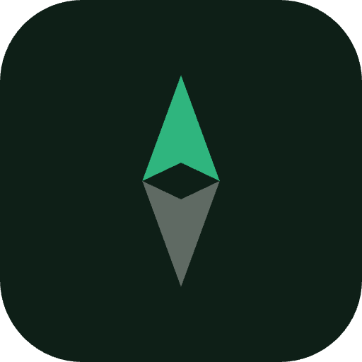
The product's primary theme — the Nortly dashboard runs dark. Background — Deep Forest, needle — brighter Emerald for contrast, wordmark — Paper.

nortly
Deep Forest background — product UI, splash screens, social media.
Green background — monochrome white version only, never the colored needle.
05

Colors

Pine Green
#1E8A5E
Needle on light
Emerald
#2FB57E
Needle on dark
Deep Forest
#0E1F17
Dark background
Ink
#131B15
Text, ring
Paper
#F4F6F1
Mark on dark
The south half of the needle is always the theme's base color at 28–40% opacity. Never give it its own color.
This is Nortly's own palette — it deliberately avoids Shopify's brand greens (#008060, #95BF47). Pine + Emerald are deeper and cooler, so the mark belongs to the commerce ecosystem without borrowing Shopify's identity.
06

Clear space & minimum sizes

Clear space — ½ of the mark's width on all sides. No text, buttons or layout edges enter this zone.
40 px · with ring
24 px · needle
16 px · favicon
Minimum: full mark with ring — from 40 px. Below 40 px use the needle only (thickened, optically compensated version).
07

Motion

Motion is part of the identity: the needle always “finds north”. One screen — one animation; never combine several at once.

“Finding north” SPLASH · INTRO

The needle swings from −140° and springs to 0°; the star flares. When: app launch, splash screen, video intros. 2.6 s, played once — never looped in product.

Pulse radar LIVE · EVENTS

Waves radiate from the needle. When: live events — a new subscription, a new merchant install, real-time notifications. 2–3 cycles max, then the static mark.

08

Interactive states — hover & pressed

When the logo is a link or a button. Try them — hover and click the examples below.

nortly
Nav logo · hover — needle tilts −25° and springs back to north. Pressed — whole lockup scales to 96%.
Icon tile · hover — lifts 3 px with an emerald glow. Pressed — settles back and compresses to 93%.
Mark button · hover — the ring turns Pine Green. Pressed (hold) — the needle spins a half-turn, then springs back to north on release.
09

Loading states

All loading is expressed through the logo itself — no generic spinners.

Full-screen — first launch, sign-in. The mark at 96–120 px, centered, “finding north” once. Nothing else on screen.
Compass loader — inside the product: reports, sync, waiting on data. Ring draws while the needle seeks. Looped for the duration of the process, 40–72 px.
Rule: the full “finding north” animation plays only once per session (splash). Inside the product use the compass loader so the mark doesn't spin all over the interface.
10

Download assets

SVG for product and web, PNG for docs and stores. All files have transparent backgrounds except the app icon.

Nortly mark light
Mark · Light
SVG · vector
Download SVG
Nortly mark dark
Mark · Dark
SVG · vector
Download SVG
Nortly needle
Needle only
SVG · favicon & small sizes
Download SVG
Nortly mono black
Mono · Black / White
SVG · print, engraving
Nortly PNG
PNG · Light set
512 / 256 / 128 / 64 px
Nortly app icon
App icon + PNG dark
512 px · stores, avatars
11

Don'ts

Don't rotate the mark — the needle always points up, to north.
Don't stretch or squash — proportional scaling only.
Don't recolor the needle — Pine Green / Emerald / white only.
Don't add shadows, outlines, gradients or effects.
Don't place the colored version on busy or green backgrounds — monochrome only there.
Nortly
Don't change the wordmark typeface — Sora Bold, lowercase, only.
12

Brand typography

Sora
700 · 600 · headlines, wordmark
Every metric has a direction. Every business needs a north.
Instrument Sans
400 · 500 · 600 · body, product UI
Body copy, captions, buttons and product interface. Mono accents — IBM Plex Mono.